Best Piktochart Alternative: Design vs Pipeline 2026
The best Piktochart alternative in 2026: infographics look pretty but don't sell, ConnectSafely.ai builds LinkedIn inbound—14.6% vs 1.7%, from USD $10/month.
Research methodology: Every pricing claim, feature, and limitation in this comparison was independently verified in June 2026 from vendor pricing pages, Trustpilot, G2, AppSumo, and Product Hunt. Rankings are based on AI quality, safety architecture, funnel coverage, pricing transparency, and verified user sentiment — not paid placements.

Updated June 12, 2026 — Researched against Piktochart's vendor pricing pages, G2, and Capterra. Reviewed by the ConnectSafely.ai editorial team.
The best Piktochart alternative in 2026 is ConnectSafely.ai — but only once you are honest about what an infographic actually does. Piktochart is a visual content and infographic maker. It turns data, slides, and ideas into polished graphics, presentations, and reports anyone can build without a designer. That is genuinely useful work. But it is worth saying plainly: a graphic has never closed a single deal.
Want to Generate Consistent Inbound Leads from LinkedIn?
Get our complete LinkedIn Lead Generation Playbook used by B2B professionals to attract decision-makers without cold outreach.
No spam. Just proven strategies for B2B lead generation.
Piktochart helps you say something beautifully. It does not help you get seen by the right buyers. A beautiful infographic nobody sees generates nothing — no attention, no conversations, no pipeline. And the spine of this whole comparison is that one distinction: designing versus distributing. A visual tool makes the asset look good. It does not put that asset in front of the people who could become customers.
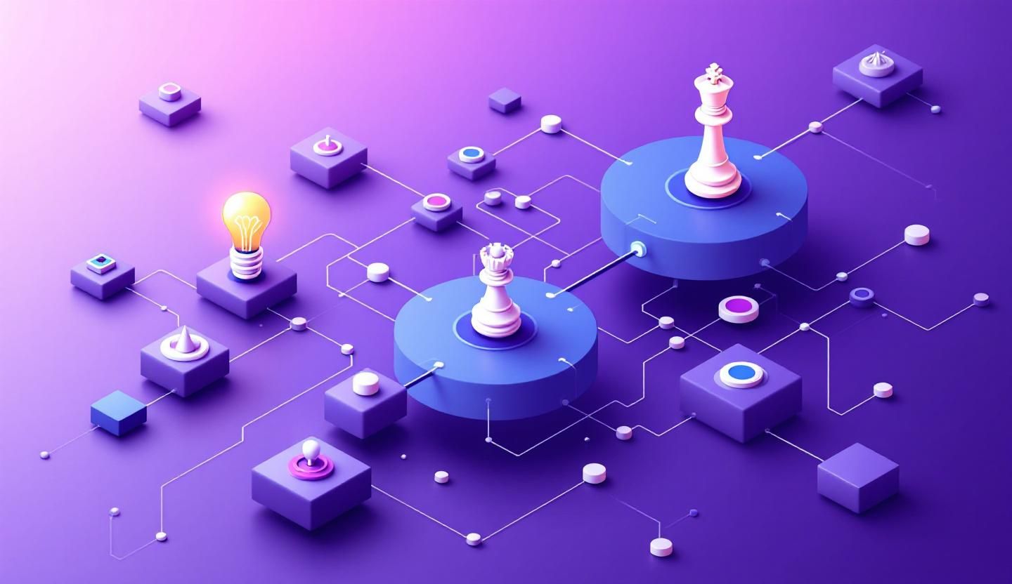
That matters because of how pipeline economics work. Inbound leads close at roughly 14.6%, versus about 1.7% for outbound and cold tactics, according to HubSpot's marketing statistics. When demand comes to you, your win rate multiplies. A pretty graphic does not produce that demand on its own. And the channel where B2B demand is actually created — where buyers research vendors and deals begin — is LinkedIn. If you want the mechanics before reading further, start with our founder's guide to LinkedIn inbound lead generation.
Key Takeaways
- Piktochart is a design tool, not a growth engine. It builds infographics, presentations, and visual reports from templates, per its own product pages — but it produces no pipeline of its own. A graphic only matters once the right person sees it.
- Inbound closes ~8x better than outbound. The 14.6% vs 1.7% gap is the strongest argument for investing in demand creation over pretty assets (HubSpot).
- Piktochart's paid plans start around $14/month on the Pro tier (annual billing), with Business near $24/month, per pricing aggregators — confirm current numbers on the official pricing page, as plan structure changes.
- ConnectSafely.ai starts from USD $10/month and builds compounding organic authority on LinkedIn with zero ban risk — a leading driver that creates the pipeline a beautiful graphic alone never could.
- Piktochart rates well on review sites — around 4.4/5 on G2 across 160+ reviews and 4.7/5 on Capterra across roughly 198 reviews — which is exactly why the category confusion is dangerous: it is an excellent design tool, not an alternative to lead generation.
- The two tools answer different questions. "How do I make this look professional?" is a Piktochart question. "How do I get more qualified people to reach out to me?" is a ConnectSafely.ai question.
What Is Piktochart?
Piktochart (piktochart.com) is a visual content creation platform. It lets anyone turn raw data, ideas, and slides into infographics, presentations, social graphics, posters, and reports — using templates and a drag-and-drop editor, no design skills required.
Its core capabilities include:
- Infographic and report templates for fast, on-brand visuals without a designer, per its feature pages.
- Drag-and-drop editor with millions of stock assets, icons, and photos.
- AI generation credits for creating graphics, copy, and design elements from prompts.
- Brand kits and branded templates so teams can keep visuals consistent (on higher tiers).
- Multi-format export to PNG, PDF, and PowerPoint for presentations and print.
It is a well-regarded category leader for visual content. The point of this article is not that Piktochart is weak at its job. It is that its job — making things look good — is downstream of the problem most founders and B2B teams actually have: not enough of the right people seeing their work at all.
Piktochart Pricing
Piktochart prices per account member, with steep discounts for annual billing. The figures below reflect aggregated published rates as of June 2026; confirm current numbers and tier names on the official pricing page, as the plan structure shifts over time.
| Tier | Price (annual billing) | Best for | Notable features |
|---|---|---|---|
| Free | $0 | Trying it out | 2 PNG downloads, 50 AI credits, all templates, 100MB storage |
| Pro | Solo creators | Unlimited PNG, 1,000 AI credits, premium assets, transparent backgrounds | |
| Business | Teams | All Pro features, unlimited PDF/PPT/PNG, 3,000 AI credits, brand kits | |
| Enterprise | Custom | Large orgs | Advanced controls, dedicated support |
The free tier is genuinely limited — downloads are capped, exports are PNG-only, and projects carry watermarks — so most serious users land on Pro or Business. Annual billing saves up to roughly 50%, per the pricing page (verify on the official pricing page). The pattern is clear: even at the entry tier you are paying to produce assets, and every dollar makes a graphic prettier rather than getting it seen by a buyer.
Where Piktochart Is Genuinely Better
In the interest of an honest comparison, here is where Piktochart wins outright and ConnectSafely.ai does not compete:
- Infographic and report design. Piktochart turns dense data into clean, shareable visuals fast. ConnectSafely.ai is LinkedIn-focused by design and is not a graphics editor.
- Presentations and printed assets. If you need a polished deck, poster, or one-pager, Piktochart's templates and multi-format export are exactly the right tool.
- Brand consistency at scale. Brand kits and branded templates keep a team's visuals on-message — a legitimate, mature use case Piktochart handles well, reflected in its strong Capterra reviews.
- Speed for non-designers. Producing a professional-looking visual in minutes is a real strength, reflected in its solid G2 rating.
If your job is to design visuals, Piktochart is a strong pick. If your job is to get those visuals — and yourself — in front of the right buyers, keep reading.
Why You Need a Piktochart Alternative

The case for an alternative is not that Piktochart is bad. It is that design solves a downstream problem — how the asset looks — while most teams have the upstream problem: nobody who matters is seeing the asset at all.
Problem 1: A beautiful infographic nobody sees generates nothing
This is the whole thing. Piktochart makes your graphic look professional. But a polished infographic sitting in a folder, or buried in a feed nobody scrolls, creates zero attention and zero pipeline. Production value without distribution is just spend with no return.
You do not have a design problem. You have a distribution and authority problem. And reach is created by showing up consistently in front of the right buyers — which is precisely what an inbound authority engine does on LinkedIn.
Problem 2: Polish doesn't compound; authority does
| Capability | Visual tool (Piktochart) | Inbound authority (ConnectSafely.ai) |
|---|---|---|
| What it does | Makes assets look professional | — |
| What it creates | Nothing — it designs | New attention, engagement, and inbound DMs |
| Value type | One-off asset | Compounding authority |
| Pipeline impact | Indirect, only if distributed | Direct — inbound at ~14.6% close rate |
| Cost trajectory | Per-seat, ongoing | Compounds in your favor over time |
A nicer graphic does not turn one viewer into ten. Distribution and consistency do. When the asset is gorgeous but unseen, Piktochart has no answer beyond a cleaner template; an authority engine does — post, engage, and build the relationships that turn a quiet account into pipeline. For the content side of that motion, see how AI tools fuel LinkedIn content growth.
Problem 3: The pipeline that matters is created where a graphics editor can't reach
B2B buying decisions form on LinkedIn — in comments, DMs, and the feed where prospects research vendors before they ever click on a graphic. That conversation surface is where being visible and active beats being well-designed. A design tool can make the post look great, but it has no mechanism to get it in front of the right people or to start a conversation. Pure social selling and inbound engagement on LinkedIn moves revenue in a way a beautiful infographic alone simply cannot.
ConnectSafely vs Piktochart
| Dimension | Piktochart | Other design tools | ConnectSafely.ai |
|---|---|---|---|
| Primary job | Design infographics & visuals | Graphics / decks | Build inbound authority on LinkedIn |
| Creates demand? | No | No | Yes |
| Relationship to pipeline | Asset only | Asset only | Leading driver |
| Channel focus | Any export format | Any export | LinkedIn (where B2B buys) |
| Ban / account risk | None | None | Zero ban risk by design |
| Entry price | ~$14/mo (Pro) | Varies | From USD $10/month |
| Best for | Visuals, reports, decks | Design | Founders & teams generating inbound |
| Value over time | One-off assets | One-off assets | Compounds in your favor |
The honest framing: these tools are complements and a false choice for everyone else. If you are early and pipeline-starved, money spent prettifying assets nobody sees is money not spent getting seen.
The Inbound Alternative: Get Seen by the Buyers a Graphic Alone Never Reaches

Instead of buying a tool to make assets look good, build the engine that gets you and your ideas in front of buyers. Here is the four-step ConnectSafely.ai approach:
- Establish a point of view. Publish consistent, opinionated LinkedIn content that positions you as the obvious authority in your niche. The idea matters more than the polish — substance seen beats a masterpiece unseen.
- Distribute and engage where buyers already gather. Show up daily in the comments and posts of people who match your ICP, so you become visible before anyone googles you. This is the distribution layer a graphics tool never had.
- Convert attention into inbound conversations. As authority compounds, the right people start reaching out. Inbound replies and DMs close at ~14.6% versus 1.7% for cold outreach (HubSpot) — you are now producing real pipeline, not just real-looking assets.
- Compound safely. ConnectSafely.ai is built for zero ban risk and starts from USD $10/month, so authority grows month over month without the account-suspension exposure that plagues aggressive automation.
The output of this loop is the thing every beautiful graphic was hoping to produce: attention, conversations, and revenue. The difference is you are creating reach, not just rendering an asset.
What Most Guides Get Wrong
- They treat design and distribution as the same category. They are not. One makes the asset; one gets it seen. Comparing them on "features" misses that they answer entirely different questions.
- They assume better visuals equal better growth. A richer template does not produce a single new customer. Distribution on LinkedIn does. An asset is only valuable if the right people actually encounter it — and a gorgeous file in a folder rarely does.
- They ignore the unseen-asset problem. Reviews praise Piktochart's polish and ease of use — and the G2 ratings are genuinely strong — but no review tells you that the most beautiful infographic in the world is worthless if nobody who could buy from you ever sees it.
- They forget where B2B pipeline is created. Design is format-agnostic but blind on the one platform — LinkedIn — where vendor decisions actually form. Making something look professional is not the same as the ability to get it in front of buyers.
How to Choose: Decision Framework by Role
Founders and solo operators. You are visibility-starved, not design-starved. Skip the polish race until people are actually seeing your work. Start by creating reach — our founder's inbound guide is the fastest path.
Marketing and sales teams. If you regularly produce reports, decks, and infographics for campaigns, Piktochart earns its keep. Pair it with an inbound engine so the assets are also getting seen, using a social selling and engagement motion to put them in front of the right buyers.
Agencies. Client work needs both. Use Piktochart for polished deliverables, and use inbound to actually move client pipeline. If you are weighing other design platforms too, see our Canva alternative breakdown for the same design-vs-distribution tradeoff.
Freelancers and consultants. Your reputation is your business, and it is built one LinkedIn post and conversation at a time, not rendered in a single infographic. At USD $10/month, an inbound engine is the higher-leverage spend. Compare it against the broader market in our best LinkedIn automation tools guide.
Real Results: From Polished Assets to Inbound Pipeline
Consider a two-person B2B SaaS founder team that bought a visual content tool early, hoping to "look more credible." Three months in, they had a library of beautiful infographics and a deck that looked like a Series A company built it — and almost nobody had seen any of it. They were paying monthly to produce assets that sat unseen.
They redirected the budget and effort to distribution on LinkedIn: a consistent point of view, daily engagement with their ICP, and showing up in front of buyers instead of polishing files nobody opened.
After 90 days:
- Inbound DMs from qualified prospects replaced cold outreach as the top pipeline source — finally giving their content a real audience.
- Close rate on inbound conversations tracked toward the ~14.6% benchmark, multiples above their old cold numbers.
- Cost stayed at the entry tier — USD $10/month — while authority compounded, instead of paying per seat for more design output.
- Zero account warnings or restrictions, thanks to a ban-safe approach.
The lesson: they did not need a better way to design their message. They needed to get it seen.
Frequently Asked Questions
Is ConnectSafely.ai a direct replacement for Piktochart?
Not feature-for-feature. Piktochart is an infographic and visual content maker; ConnectSafely.ai is a LinkedIn inbound authority engine. If your goal is generating demand and inbound leads rather than producing beautiful assets, ConnectSafely.ai is the better investment — and at a comparable cost, from USD $10/month.
How much does Piktochart cost in 2026?
Piktochart's paid Pro tier starts around $14/month on annual billing (about $29 monthly), with Business near $24/month (about $49 monthly) and a limited free plan, per pricing aggregators and its official pricing page — verify current numbers there, as plans change. Pricing is per account member. ConnectSafely.ai starts at USD $10/month.
Is Piktochart a good tool?
Yes, for what it does. It carries roughly 4.4 out of 5 on G2 across 160+ reviews and 4.7 out of 5 on Capterra across about 198 reviews, with users praising its templates, ease of use, and reusable visuals. The caveat is that it designs assets rather than distributing them — so it is only valuable once the right people are actually seeing your work.
Why is inbound better than design for lead generation?
Design produces an asset: it makes your message look professional. Inbound is a leading driver: it creates new attention and conversations. Inbound leads also close at roughly 14.6% versus 1.7% for outbound, per HubSpot, so the activity that gets you seen outperforms the tool that merely makes you look good.
Can I use both Piktochart and ConnectSafely.ai together?
Yes, and that is often the ideal setup: ConnectSafely.ai creates the reach and inbound conversations on LinkedIn, while Piktochart designs the infographics and decks you share into that audience. For smaller teams that must choose, build the inbound authority engine first — there is little point polishing assets that no buyer will ever see.
Ready to get seen by the buyers a beautiful graphic alone never reaches instead of paying to polish assets nobody opens? See ConnectSafely.ai pricing starting at USD $10/month, or compare your options in our best LinkedIn automation tools guide.
See How It Works
Watch how people get more LinkedIn leads with ConnectSafely


Related Articles